Responsive
Web Design
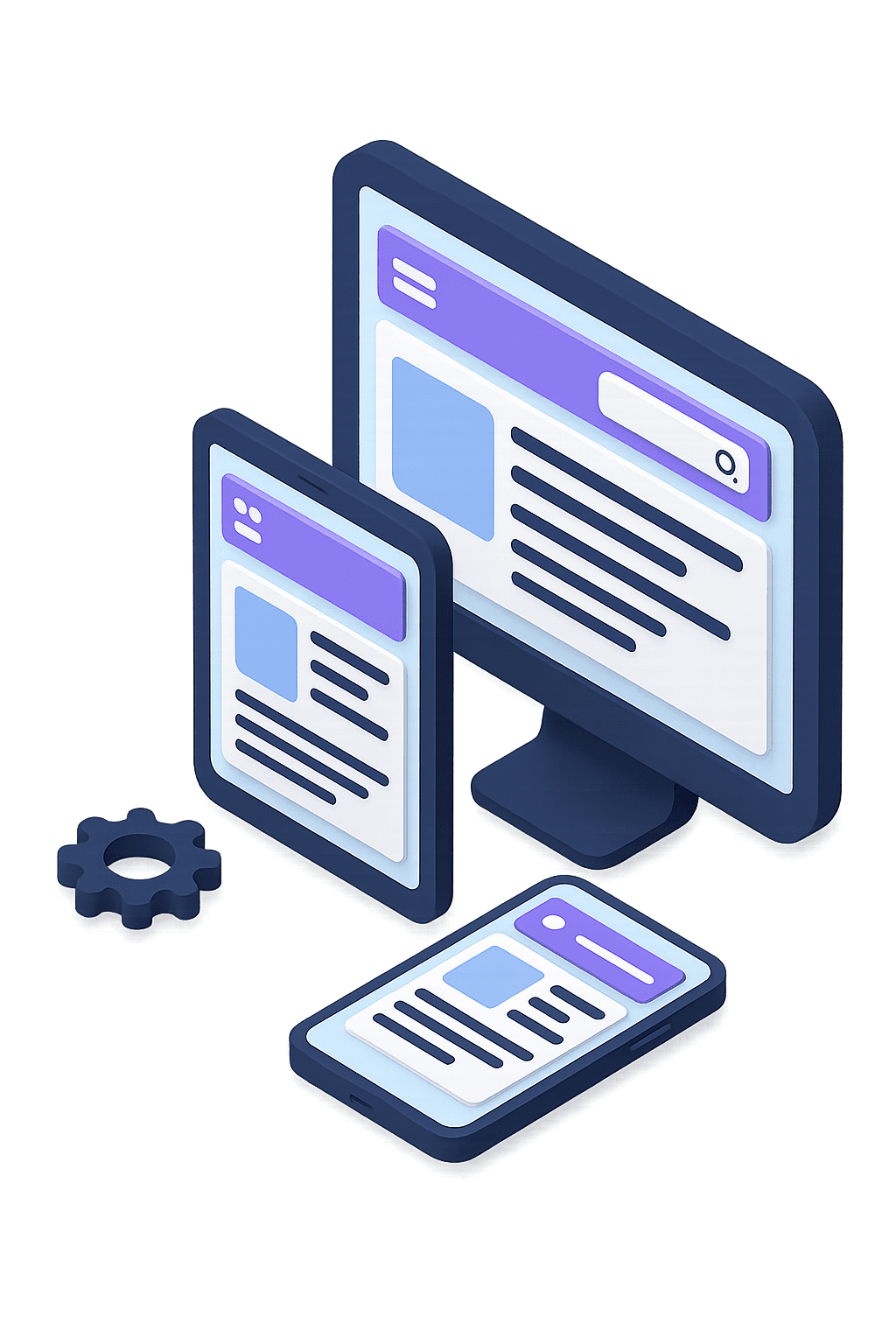
Responsive Web Design
Responsive Web Design for Every Screen, Every User
At HezalNova, we design and develop fully responsive websites that adapt beautifully to all screen sizes and devices.
Whether your visitors are on mobile, tablet, or desktop — we ensure your site looks and performs flawlessly.
With mobile traffic dominating the web, responsive design is no longer optional — it’s essential. Our mobile-first approach improves user engagement, reduces bounce rates, and boosts conversions.
What’s Included in Our Responsive Web Design Services
- Mobile-First Design – Designed from the ground up for smartphones and tablets first, then scaled for desktops.
- Cross-Browser Compatibility – Your website will look great in Chrome, Safari, Firefox, Edge, and more.
- Flexible Layouts & Grids – Fluid designs using CSS media queries and scalable content structure.
- Touch-Optimized UI – Easy navigation, tappable buttons, and fast-loading pages for mobile users.
- Speed & Performance Optimization – Fast load times, compressed assets, and clean code for better SEO and user experience.
Benefits of Responsive Web Design
- Improved mobile experience for your visitors
- Better search engine rankings (Google mobile-first indexing)
- Higher engagement and lower bounce rates
- Single website that works across all devices
- Easier maintenance and future scalability
Ideal for:
- Business and corporate websites
- eCommerce platforms
- Portfolio and personal sites
- Educational or eLearning portals
- Hotel and booking websites